Mapping our Philadelphia experience
We all use maps to help orient ourselves in space, navigate an area, or learn more about what’s around us. But maps can also be a source of stories about a place – and, as participants at two special events learned last week, the information available on a map can suggest a story that either contradicts or complements individuals’ lived experience. In that tension lives the possibility for a creative, human-driven use of maps – the often complex, messy rejoinders to dominant narratives about a city.
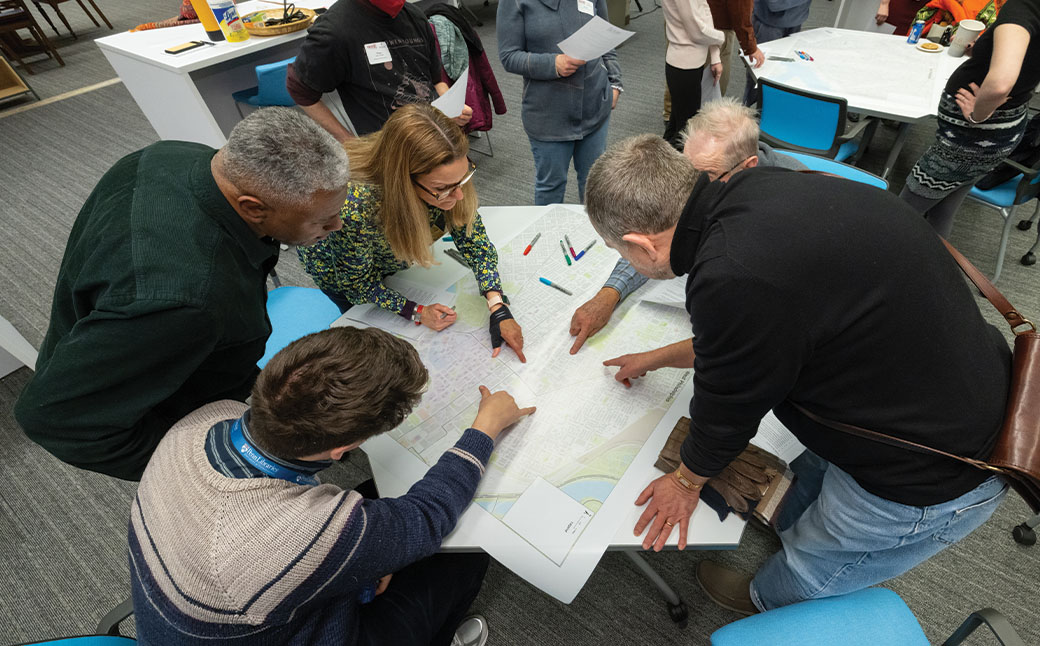
Over two evenings at the Penn Libraries, 24 participants joined our education and engagement team for the Map Table, a kickoff community engagement event for Toll the Bell, our season-long focus on the ongoing gun violence crisis. Located in the Research Data and Digital Scholarship room at Van Pelt Library, these events were co-facilitated by geospatial data librarians Girmaye Misgna and Ben Liebersohn as well as Public Digital Scholarship Librarian Cynthia Heider. Welcoming participants from faith-based organizations across the city as well as community leaders, Misgna and Liebersohn opened with an introduction to the many types of data that can be projected onto a map of Philadelphia: SEPTA bus and subway routes, median household income, racial and ethnic demographic information, redlining history, Strava walking routes and more. Such data can create cultural profiles of communities as well as a general sense of affluence or being under-resourced.
From there, participants were invited to add their own annotations, stories and legends to blank maps of Philadelphia neighborhoods, contributing to what geographers call “human geography.” Participants from Norris Square Neighborhood Project, Calvary Episcopal Church, EMIR Healing Center and elsewhere immediately got to work discussing daily routines – the regional rail and bus combinations teenagers took to work, the landmarks where people worked and went to school – as well as history. The site of the former studio where American Bandstand was filmed received an annotation, as did the site of the MOVE bombing, in the margin of the West Philadelphia map. Favorite restaurants, places to celebrate a birthday and soothing community gardens appeared. One participant outlined the bus route of a relative who worked for SEPTA. Teenagers pointed out their schools, the community centers where they worked and their sometimes-long journeys home.
When we returned to observe each other’s annotations, we also examined a heat map of shootings in Philadelphia. How, we asked, did such a map feel related to the work participants had done adding their own stories, marking the city with their daily lives, memories, families, work and routines? One woman noted that although she was acutely aware of the atmosphere just north of her community organization’s headquarters, one of the areas marked most densely with violence, she had annotated the blank maps only with what felt familiar and normal to her, not with traumatic incidents. A young man noted that the places he marked as feeling most at home, or most in community, were also close to the coordinates marked most violent on the heat map. How could it be that a place whose data branded it as dangerous felt safe to him?
“Kids don’t have to grow up the way I did,” a church leader said, “but I want them to be safe.” Teenage participants talked about their public transit routes to school and work, how they noticed unsafe conditions and tried to stay focused, but still worried about children younger than themselves, their possible encounters with an unstable person or an abandoned needle. Participants immediately grew wise to the ways their detailed, personal contributions to the maps complicated the narrative that someone might construe about a particular neighborhood given only the shooting data. Normalcy, community, work, family and celebration became the disrupters of a story about violence, rather than the other way around. The heat map might have suggested a besieged city; survival told differently.
In the coming weeks, PLA and library staff will prepare to transfer the map annotations to a digital, interactive map, not unlike a My Google Map, on which anyone can contribute. During the next few months, participants at partner organizations and worship communities will be able to add their landmarks and stories to a map that will also include partners for our June 7 Toll the Bell sound installation. As bells ring on that day, we hope that curious bystanders will peruse this collectively generated map, one that acknowledges the city’s traumas and challenges but is ultimately overwhelmed by life.